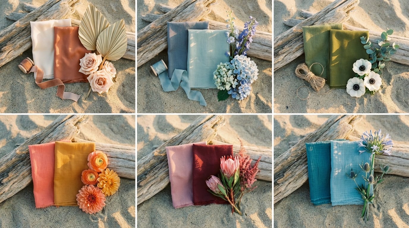
Why Do Some Wedding Colors Fail on the Beach?
Beach environments reflect significantly more ambient light than indoor venues, causing pastels to wash out and saturated colors to photograph overly bright without proper tone balancing.
You’ve spent hours curating Pinterest boards, saving swatches, and envisioning your ceremony against turquoise water. Then the photos come back, and your carefully chosen beach colors for wedding day look nothing like you planned. This disconnect between inspiration and reality is one of the most common frustrations couples face, and it comes down to physics, not taste.
The Reflected Light Problem: Sand as a Giant Reflector
Sand acts like a massive natural reflector, bouncing sunlight upward into every surface, fabric, and face. This reflected light fills in shadows (great for skin) but also desaturates colors. A soft blush that looks rich and dimensional indoors can appear nearly white when surrounded by bright sand. Photographers call this “fill light,” and while it’s flattering for portraits, it strips away the subtle tonal differences that make a color palette feel layered.
How Water Changes Color Temperature in Photos
Ocean water shifts the color temperature of your environment depending on the time of day and sky conditions. On overcast days, water reads cool and blue-grey, pulling warm tones like coral and peach toward muddy territory. On bright days, the water’s reflected cyan light competes with any blue in your palette, making your “dusty blue” linens look grey by comparison. Colors that harmonize with the water’s undertones, rather than trying to match it exactly, tend to photograph better.
Why Time of Day Matters More Than You Think
A midday ceremony under direct sun creates harsh, high-contrast light that makes bold colors look almost neon in photos. A golden hour ceremony (roughly 60–90 minutes before sunset) wraps everything in warm amber light, which deepens warm tones and mutes cool ones. The same bridesmaid dress in sage green can look vibrant and earthy at 5:30 PM or flat and institutional at noon. Your ceremony time isn’t just a scheduling detail—it’s a color decision.
What Makes a Beach Wedding Color Palette Actually Work?
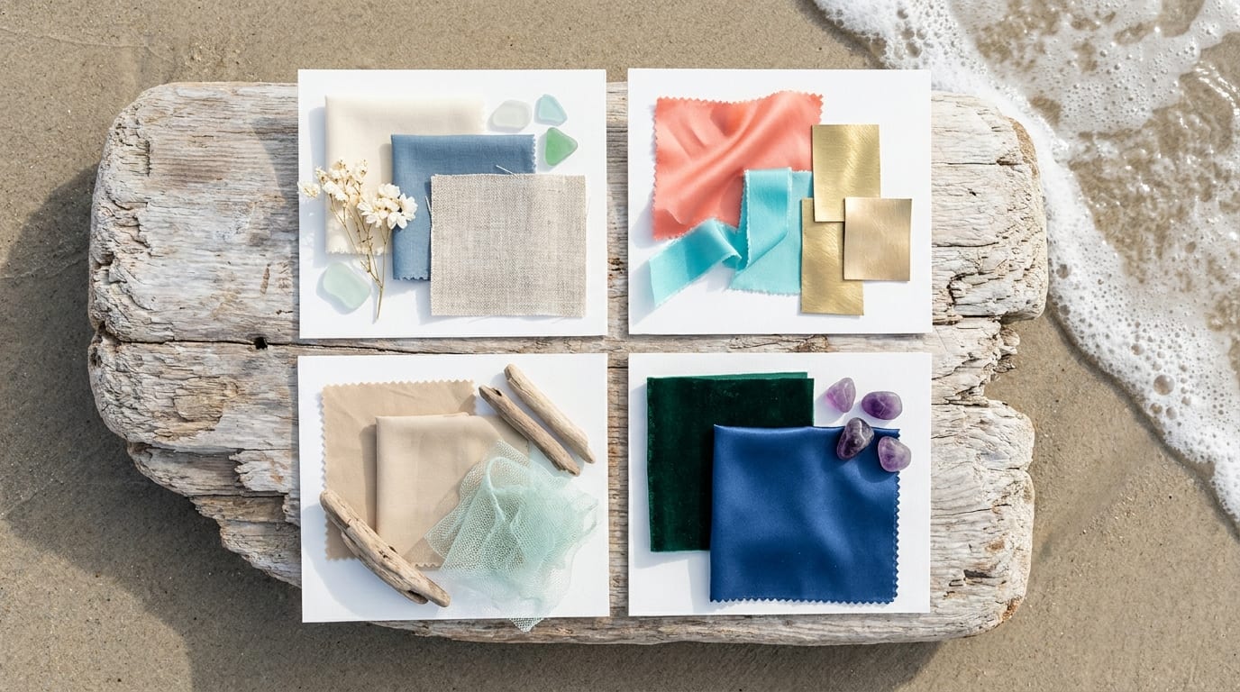
A successful beach palette echoes the natural surroundings, uses limited and balanced colors, and is tested across real materials and lighting so it feels cohesive rather than chaotic.
Almost 90% of couples say it’s important that their color palette flatters attire and matches the venue setting [Source: Media.io]. For beach weddings, the stakes are higher because your “venue” is a living, shifting landscape of water, sky, and sand. If you’re still narrowing down your overall vision, our beach wedding planning guide covers how to align color choices with venue logistics.
The 60-30-10 Rule for Beach Color Distribution
Vistaprint’s 2026 wedding color guide recommends a 60-30-10 ratio: 60% dominant color on linens, backdrops, and large surfaces; 30% secondary color in florals and attire; and 10% accent color in small details like foil stamping and décor [Source: Vistaprint]. For a beach wedding, a typical application might be 60% sand or champagne, 30% seafoam or dusty blue, and 10% coral or soft gold. Martha Stewart’s design team recommends choosing 1–2 main colors, 1–2 secondary colors (including at least one neutral), plus one accent metallic used sparingly [Source: Martha Stewart].
Undertones That Complement (vs. Clash With) Ocean Blues
Colors with warm blue or green undertones—think teal, sage, seafoam, and dusty blue—naturally blend with the ocean backdrop. Colors with strong yellow or orange undertones (mustard, marigold, bright tangerine) can create visual tension against blue water unless they’re balanced with enough neutral space. The key is choosing at least one color that shares an undertone with the water at your specific venue.
Saturation Levels That Photograph Well in Bright Light
Medium saturation is the sweet spot. Very pale colors disappear in bright light, and very saturated colors look garish. An analysis of 500+ real weddings found the most successful palettes include no more than 3–4 core colors and evolve throughout the day—softer at the ceremony and bolder at the reception [Source: L’invit Instant]. Media.io suggests structuring a coastal palette around five functional roles: one light base, one dark anchor color, two mid-tone supporting colors, and one accent [Source: Media.io].
Classic Coastal: Whites, Blues, and Natural Textures
A white-and-blue base is the most statistically popular coastal palette, with 41% of U.S. couples using white and 26% using light blue in their weddings overall.
The Knot’s national wedding color report found that light blue jumps to 32% for April–June weddings and 27% for July–September weddings [Source: The Knot]. Gen Z couples use pale blue at an even higher rate: 28%, five percentage points above Millennials. Dark blues (navy, indigo, midnight) were used by 24% of couples, favored for classic and slightly formal looks. Meanwhile, 32% of couples used ivory or champagne—soft, desaturated tones that pair naturally with coastal textures. This combination isn’t just safe—it’s mainstream for coastal celebrations.
Specific Shades That Work (With Hex Codes)
| Color Role | Color Name | Hex Code | Pantone Equivalent |
|---|---|---|---|
| Dominant (60%) | Warm Ivory | #FFFFF0 | 11-0604 TCX Gardenia |
| Secondary (30%) | Dusty Blue | #6699CC | 15-4020 TCX Cerulean |
| Supporting | Natural Linen | #C4B69C | 14-1012 TCX Champagne Beige |
| Accent (10%) | Champagne Gold | #D4AF37 | 16-0836 TCX Rich Gold |
Fabric Choices That Add Dimension
With a restrained color palette, texture does the heavy lifting. Linen tablecloths, raw silk bridesmaid dresses, and cotton voile draping create visual interest through material variation rather than color contrast. Avoid satin in this palette—it reflects too much light on the beach and can look cheap in photos.
When This Palette Falls Flat
At tropical destinations with lush green vegetation (think Jamaica or Costa Rica), this palette can feel washed out against the vivid landscape. It works best at locations where the natural backdrop is already muted: white sand beaches, rocky coastlines, or desert-meets-ocean settings.
Tropical Vibrance: Coral, Turquoise, and Gold Accents
Coral, turquoise, and champagne gold create energy without looking cartoonish, making this palette ideal for Caribbean and Mexican beach weddings with lush vegetation backdrops.
Media.io recommends a structure of 60% light neutral, 25% main color, 10% supporting color, and 5% accent for tropical palettes, with coral or turquoise as the main colors and gold as a small accent layer [Source: Media.io].
Balancing Bold Colors With Neutral Linens
The biggest mistake with tropical palettes is going bold everywhere. Use white or ivory linens as your base, then introduce coral and turquoise through florals, napkins, and attire. Gold appears only in flatware, candle holders, or small signage details. This prevents the “theme park” look that many couples worry about.
Floral Varieties That Match This Palette
Coral charm peonies, orange ranunculus, and turquoise-tinted hydrangeas (achieved through water tinting) work well. For budget-friendly options, coral gerbera daisies and tropical heliconia are widely available at Caribbean destinations and typically cost less than imported European varieties. Expect to pay $150–$300 for a bridal bouquet in this palette at most Cancún or Punta Cana venues, though costs vary by season and vendor.
Lighting Conditions Where This Palette Excels
Late afternoon light (3–5 PM) deepens coral into a rich salmon and makes turquoise pop without looking neon. Avoid midday ceremonies with this palette—direct overhead sun washes coral toward peach and makes turquoise look almost white in photos.
Sunset Romance: Blush, Terracotta, and Sage
This warm-toned palette mimics golden hour light with dusty rose, burnt orange, and muted sage, and it photographs best during late afternoon ceremonies.
Terracotta plus blush is trending in boho tropical wedding themes and has appeared consistently across 2025–2026 Pinterest boards and curated palette lists [Source: L’invit Instant]. Blush bridesmaid dresses are widely described as a classic choice for beach weddings because they’re versatile, romantic, and flattering in any season. “Sage Green Beach Wedding” has been singled out as a favorite across recent and upcoming years, suggesting multi-year trend persistence for this earthy palette family.
Why This Palette Needs Strategic Timing
Under midday sun, terracotta can look muddy and sage can appear grey-green. Schedule your ceremony for 90 minutes before sunset, and this palette transforms. Golden hour light amplifies every warm tone, making terracotta glow and blush look luminous against sand.
Bridesmaid Dress Fabrics That Avoid Looking Muddy
Chiffon and crepe in blush photograph well because they have a slight sheen that catches warm light without being reflective. Avoid matte jersey in terracotta tones—it absorbs light and can look flat. For sage, a lightweight satin or charmeuse adds enough dimension to keep the color from reading as dull.
Floral Sourcing Challenges (and Solutions)
True terracotta-colored flowers are limited. Burnt orange roses, rust-toned chrysanthemums, and dried palm leaves fill this gap. Sage greenery is abundant (eucalyptus, dusty miller), but confirm with your destination florist that these varieties are available locally. Imported greenery wilts faster in tropical heat.
Mediterranean Elegance: Navy, White, and Lemon Yellow
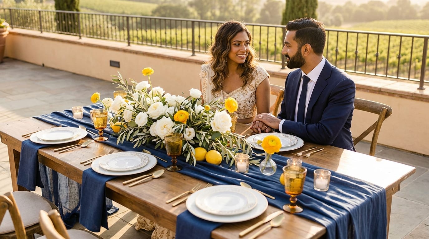
Navy, crisp white, and lemon yellow create Santorini-inspired sophistication, but this palette requires careful fabric selection to avoid looking nautical-themed rather than elegant.
A beach wedding palette guide explicitly lists the Amalfi Coast combination as “lemon yellow, navy, white,” positioning it as a signature Mediterranean beach combination [Source: L’invit Instant]. Dark blues (navy, indigo, midnight) were used by 24% of couples overall, favored for classic and slightly formal looks [Source: The Knot].
The Fine Line Between Elegant and Costume-y
The risk here is obvious: too much navy and white reads “nautical party.” The fix is proportion and texture. Keep navy to structured elements (groomsmen’s suits, chair sashes), use white as the dominant base, and introduce lemon yellow only as a 10% accent in florals, citrus table décor, or stationery details.
Table Linen Textures That Elevate This Palette
White linen with a visible weave (not smooth polyester) creates a Mediterranean feel. Layer with navy cotton napkins and a single lemon or small citrus arrangement per table. Avoid printed patterns—stripes or anchors will push the palette into costume territory immediately.
When to Add Metallic Accents (and Which Ones)
Brushed gold flatware and candlesticks warm up the navy-white contrast. Avoid silver, which makes the palette feel colder and more corporate. A small amount of brass or antique gold in lanterns or signage frames adds warmth without competing with the lemon yellow accent.
Bohemian Beach: Rust, Cream, and Dusty Purple
Rust, cream, and mauve create an earthy, romantic feel that works best at beaches with dunes, driftwood, or desert-meets-ocean landscapes like Tulum or Southern California.
80% of couples say they are intentional about choosing specific wedding colors, with 84% of Gen Z and 79% of Millennials reporting deliberate palette selection [Source: The Knot]. For bohemian beach palettes, that intentionality often results in coordinating one or two statement colors (like rust or purple) with soft neutrals (like cream). For more on how to style a relaxed coastal ceremony, see our bohemian beach wedding ideas.
Dried vs. Fresh Florals for This Aesthetic
A mix of both works best. Dried pampas grass and preserved eucalyptus provide the boho texture, while fresh garden roses in mauve and ranunculus in rust add color depth. Fully dried arrangements can look brittle and sad in ocean wind, so anchor them with fresh greenery.
Rental Decor That Matches (Without Looking Shabby)
Macramé backdrops, rattan furniture, and woven rugs define this aesthetic. Budget $800–$2,000 for ceremony and lounge area rentals at most beach destinations, though costs vary significantly by location. Confirm with your rental vendor that items are rated for outdoor use—indoor-only pieces deteriorate quickly in salt air.
Locations Where This Palette Looks Out of Place
This palette clashes with bright white sand and vivid turquoise water (think Punta Cana or the Bahamas). The earthy tones need a muted, textured backdrop to shine. Rocky beaches, tan sand, and arid coastal landscapes are ideal.
Minimalist Luxe: Taupe, Ivory, and Greenery
Taupe, ivory, and natural greenery create understated sophistication that relies on texture and quality over color impact, requiring higher-end rentals and florals to avoid looking bland.
Why This Palette Demands Premium Vendors
Without bold color to create visual interest, every detail matters more. Cheap linens, plastic chairs, and grocery-store greenery will be painfully obvious. Budget for quality rentals: velvet table runners, ceramic vessels, and real wood furniture.
Greenery Types That Withstand Beach Conditions
Eucalyptus (silver dollar and seeded varieties), Italian ruscus, and monstera leaves tolerate heat and wind well. Ferns wilt within hours in direct sun. Succulents are excellent for table arrangements and boutonnieres, holding up all day without water.
Adding Visual Interest Without Adding Color
Layer textures aggressively: linen, velvet, raw wood, ceramic, and woven materials. Vary greenery shapes (trailing, bushy, architectural). Use candlelight at the reception to add warmth. This palette transforms dramatically from daylight ceremony to candlelit dinner—a feature, not a flaw.
How Do You Test Colors Before Committing?
Order fabric swatches in your exact materials, photograph them at your venue during your ceremony time, and view photos on multiple devices to see how colors translate digitally.
The Fabric Swatch Test (Step-by-Step)
-
Order swatches in the actual fabric you’ll use (chiffon, linen, satin), not just paper color chips.
-
Bring them to your venue or a similar outdoor location.
-
Photograph them against sand, held up against the sky, and next to any greenery or structures at the venue.
-
Shoot at the same time of day as your planned ceremony.
-
Review photos on your phone, a laptop, and a tablet. Colors shift across screens.
Why You Need Photos at the Actual Time of Day
Vistaprint’s 2026 wedding guide emphasizes using the 60-30-10 ratio to test how much each color will visually “take over” the space before committing [Source: Vistaprint]. That test only works if you’re seeing colors under the same light they’ll appear in on your wedding day. A swatch photographed at 10 AM will look completely different than the same swatch at 5 PM.
Digital vs. Print: How Colors Shift
Disclaimer: Color perception varies by screen calibration and printing methods. Hex codes and Pantone references in this article are starting points, not exact guarantees of how colors will appear on your specific devices or in printed materials.
Colors on screens use RGB light (additive color), while printed materials use CMYK ink (subtractive color). A vibrant coral on your monitor may print as a muted salmon. Always request printed proofs from your stationer and compare them to your physical swatches under natural light.
What About Bridesmaid Dresses in Beach Light?
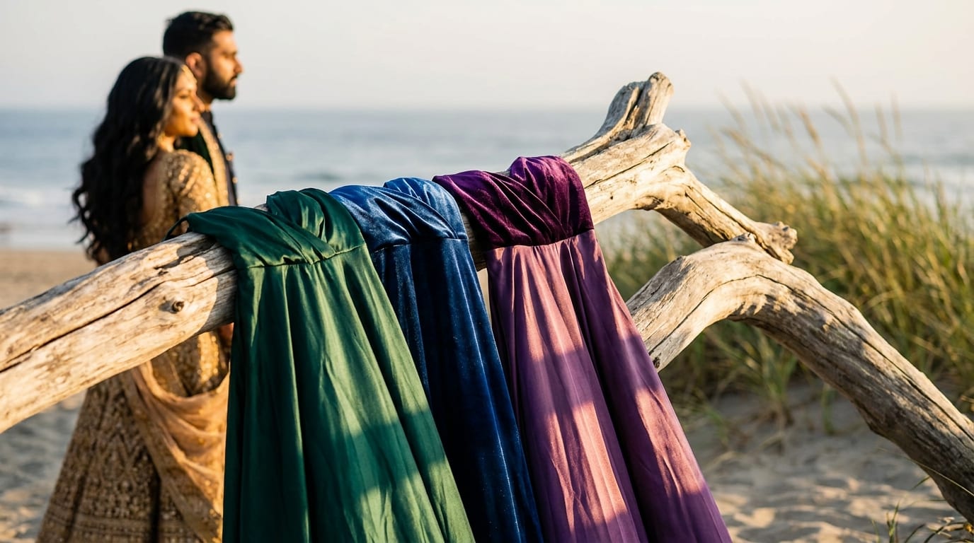
Choose dresses in medium-weight fabrics with some structure, avoid pure pastels and overly shiny materials, and test swatches against sand to ensure the color doesn’t blend into the background.
Fabrics That Photograph Well (and Those That Don’t)
Chiffon and crepe are the workhorses of beach bridesmaid dresses. They move beautifully in wind, drape well in photos, and have enough body to hold color. Avoid charmeuse satin (too shiny, creates hot spots in photos) and heavy jersey (clings in humidity and absorbs light).
The Sand-Blend Problem With Certain Neutrals
Champagne, nude, and light taupe dresses can disappear against tan sand, making your bridal party look washed out in wide shots. If you want neutrals, go deeper: mocha, warm grey, or terracotta. Or choose a venue with white sand where these tones will contrast naturally.
Mismatched Dress Strategies for Beach Weddings
Mismatched bridesmaid dresses work exceptionally well on the beach because the casual setting supports a relaxed, organic look. The key is constraining the color family. Give your bridesmaids a specific Pantone range (e.g., Pantone 7605–7608 for a blush family) and let them choose their own silhouettes. This creates cohesion without rigidity and ensures every skin tone is flattered.
How Do Florals Change Your Color Story?
Florals introduce organic color variation that can either anchor or overwhelm your palette, so use them as your accent color and choose varieties that won’t wilt in heat.
Floral designers recommend starting with the existing “color environment” of ocean, sky, sand, and greenery, then building floral selections that echo rather than compete with those natural tones [Source: Whole Blossoms]. Blue hydrangeas paired with white orchids or roses are standard for ocean-inspired bouquets, evoking the serene colors of the sea. These florals disappear into the landscape in the best way—they make the whole event feel cohesive, calm, and light rather than “décor on top of scenery.”
Heat-Tolerant Flowers by Color Family
| Color Family | Heat-Tolerant Options | Avoid |
|---|---|---|
| White/Ivory | Orchids, plumeria, gardenias | Peonies (wilt fast in heat) |
| Pink/Blush | Garden roses, protea, bougainvillea | Sweet peas (delicate, heat-sensitive) |
| Coral/Orange | Heliconia, gerbera daisies, celosia | Tulips (droop within hours) |
| Blue/Purple | Hydrangeas, delphiniums, statice | Lavender (dries out rapidly) |
| Greenery | Eucalyptus, monstera, ruscus | Ferns (wilt in direct sun) |
Greenery as a Color Anchor
Common coastal tones include soft blues, ivory, blush, coral, seafoam green, and sandy neutrals [Source: Whole Blossoms]. Greenery ties all of these together. A runner of mixed eucalyptus down a reception table creates a visual through-line that connects disparate accent colors and prevents the palette from feeling scattered.
When to Use Faux Florals (Without Looking Cheap)
High-quality silk flowers have improved dramatically. For ceremony arches exposed to hours of direct sun, faux florals maintain their shape and color where fresh flowers would wilt. Mix them with real greenery for a natural look. The key is avoiding plastic-looking stems and choosing silk varieties with realistic color variation and imperfect petals.
What Colors Should You Avoid at Beach Weddings?
Avoid pure white (washes out), neon brights (photograph harshly), and very dark colors like black or burgundy that absorb too much heat and look heavy against light backgrounds.
The Pure White Problem
Pure white (#FFFFFF) reflects so much light on a beach that it blows out in photos, losing all detail and texture. Ivory (#FFFFF0), cream (#FFFDD0), or warm white with yellow undertones photograph with more dimension. This applies to everything: linens, dresses, and paper goods.
Why Neons Photograph Poorly
Neon colors (hot pink, electric blue, lime green) create color cast problems in photos. The bright pigments reflect onto nearby surfaces and skin, giving everything a tinted glow. In post-processing, photographers struggle to correct skin tones without also desaturating the intentional color, leading to compromises in the final images.
Dark Colors That Work (and Those That Don’t)
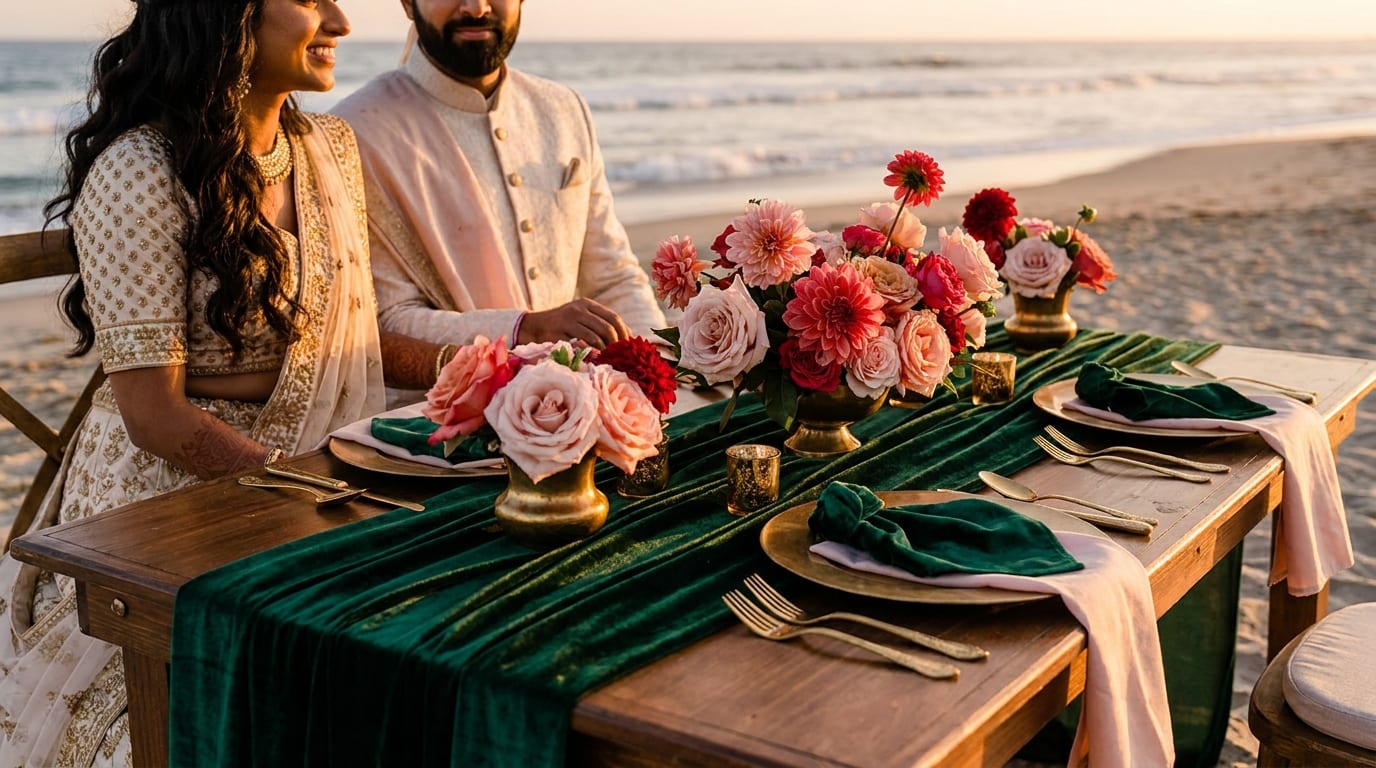
Navy works because it reads as a deep neutral. Black absorbs heat (uncomfortable for the wedding party) and creates harsh contrast against bright sand and sky. Burgundy and deep plum can work as small accents (10% or less) but look oppressively heavy as a dominant color. If you want drama, try emerald green or deep teal—dark enough to create contrast but with enough blue-green undertone to harmonize with the ocean.
How Do You Communicate Colors to Vendors?
Use Pantone codes or hex values, send physical swatches via mail, and create a shared reference board with real wedding photos showing your exact color combinations.
Why Color Names Aren’t Enough
One florist’s “coral” is another’s “peach” is another’s “salmon.” Color names are subjective and culturally variable. X-Rite, a leading color management company, states that the most accurate way to communicate and evaluate color is to use a color measurement device, because the resulting numeric value “can only be interpreted as that color” [Source: X-Rite]. Physical color standards and swatches let vendors visually compare their materials to your target under consistent lighting conditions, and a light booth can simulate how colors will look outdoors or under different bulbs.
The Pantone vs. Hex Code Debate
Pantone codes are the gold standard for physical materials (fabrics, printed paper, florals) because they reference actual physical color chips. Hex codes work for digital design (websites, digital invitations, social media graphics). For a wedding, you’ll likely need both. Give your florist and linen vendor Pantone references, and give your stationer and web designer hex codes.
Creating a Vendor-Proof Color Reference Guide
Using a color standards provider for textiles can reduce approval rounds by roughly 75% compared with sending inspirational images directly to vendors [Source: X-Rite]. For your wedding, create a one-page PDF that includes: your Pantone codes, hex values, a photo of your physical swatches under natural light, and 3–5 real wedding photos (not styled shoots) showing the colors in context. Mail physical swatches to every vendor who handles color-critical elements.
Frequently Asked Questions
What are the most popular beach wedding colors?
White and light blue dominate. 41% of U.S. couples use white in their palette, and light blue appears in 26% of weddings overall, rising to 32% for spring weddings [Source: The Knot]. Ivory, champagne (used by 32% of couples), and seafoam green are also consistently popular coastal choices.
How many colors should a beach wedding palette have?
Stick to 2–3 core hues, one strong neutral, and one metallic accent. Wedding planners recommend that fewer colors executed well creates more impact than many colors competing for attention [Source: L’invit Instant].
Do pastel colors work for beach weddings?
Pastels can wash out in bright beach light because sand reflects so much ambient light upward. If you love pastels, choose versions with slightly deeper saturation (dusty rose instead of baby pink, dusty blue instead of powder blue) and schedule your ceremony for golden hour when warm light enriches soft tones.
How do I keep bridesmaid dresses from looking washed out on the beach?
Choose medium-saturation colors in chiffon or crepe fabrics. Avoid pure pastels and shiny satin. Test swatches against sand at your venue during your ceremony time. If you’re using neutrals, go deeper (mocha or warm grey) to avoid blending into a tan sand backdrop.
Should I choose different colors for a Caribbean versus Mediterranean beach wedding?
Yes. Caribbean venues with lush green vegetation and turquoise water support bolder, warmer palettes (coral, tropical greens, gold). Mediterranean settings with white architecture and deep blue water suit cooler, more structured palettes (navy, white, lemon yellow, olive). Match your palette to the existing landscape rather than fighting it.
Can I use black at a beach wedding?
Black absorbs heat, making it uncomfortable for the wedding party, and creates harsh contrast against bright sand and sky. If you want a dark anchor color, navy or deep emerald green provide similar drama while harmonizing with the coastal environment.
How do I make sure my florist and other vendors match my exact colors?
Provide Pantone codes for physical materials and hex codes for digital items. Mail physical fabric swatches to every vendor handling color-critical elements. Using standardized color references instead of color names alone can reduce miscommunication and cut approval rounds significantly [Source: X-Rite].
What time of day is best for beach wedding color photography?
Golden hour, roughly 60–90 minutes before sunset, is ideal. The warm, diffused light deepens warm tones, softens cool tones, and eliminates the harsh shadows and blown-out highlights that midday sun creates. If a midday ceremony is unavoidable, choose medium-saturation colors and avoid pastels.